Page 2 of 2
Re: So far...
Posted: Tue Feb 05, 2013 3:57 pm
by the incubus
If this year's Williams look as good as last year's car with the modesty panel, we will have to throw them into the mix.
So far looking REALLY good!

Re: So far...
Posted: Tue Feb 05, 2013 4:00 pm
by Covalent
Agreed! Really slick looking car.
Re: So far...
Posted: Tue Feb 05, 2013 4:55 pm
by RaisinChips
I don't like the new Marussia, looks a lot like Indycar.
Re: So far...
Posted: Tue Feb 05, 2013 5:01 pm
by shift
Re: So far...
Posted: Tue Feb 05, 2013 5:53 pm
by GeonyWalker
Caterham.... 'nuff said.
Re: So far...
Posted: Tue Feb 05, 2013 5:57 pm
by OutKast
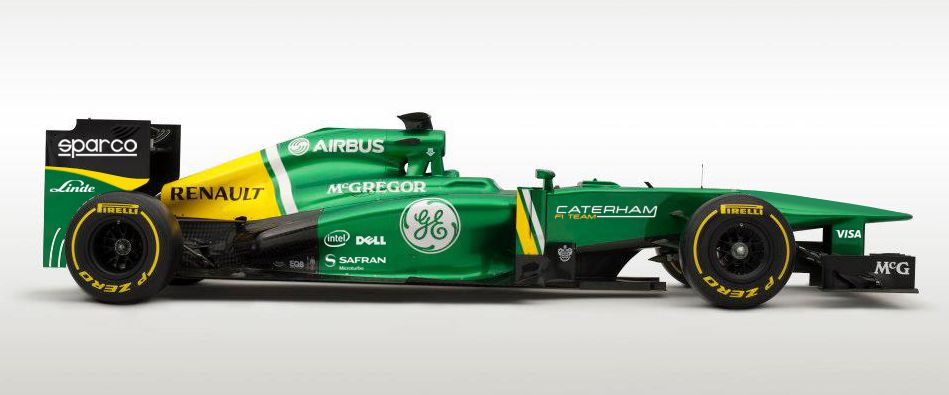
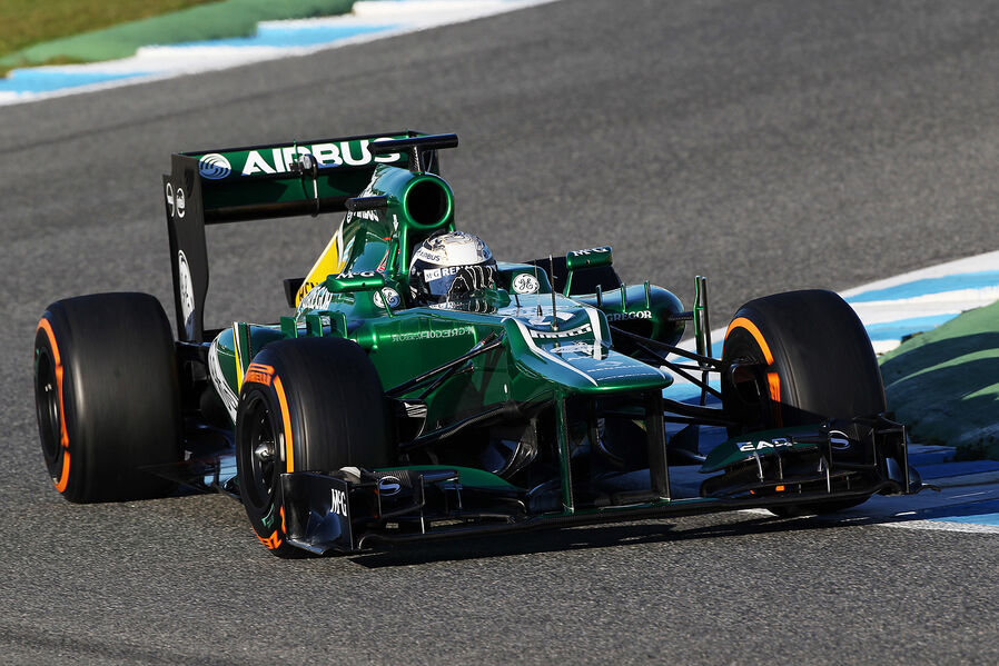
That Caterham with the British Racing Green is goregous. Looks like the type of paint you see on a TVR.
That Caterham looks quick as hell and I would like to see Charles Pic break into the midfield this season.
Re: So far...
Posted: Tue Feb 05, 2013 6:37 pm
by the incubus
purchville wrote:This one beats all in your list:

It's a terrible picture to begin with but I've sprinkled some of my photoshop pixie dust on it and there's not much more to it.
Looks quite a bit similar to last year's McLaren nose. They need a designer on board to design a better livery. There is so much more that can be done with these 3 colors and the way they just plop it on there does nothing to accentuate the lines of the car. Still Sauber, then Ferrari, then McLaren.
The Caterham… what a LAZY approach!
Running essentially last years car with some updates and absolutely no change on that putrid nose. Budget must be extremely tight if they didn't even look into it. The lighter green, while a departure from the Lotus Green everyone loves, is really nice but the white lines on the nose should be yellow to match the rest of the car. As it is with the white lines, there's no flow tying the front end to the rear. As well the lines where the yellow and white lines but to the green are all different. Almost vertical at the rear, angled backwards a bit on the turning vanes, and just no artistry behind anything on the car.
With a little design prowess and a keen eye, one can place a bunch of logos on a car without hurting its looks.
Actual car as introduced:
 <— YUCK!
Here's one for you Caterham fans.
<— YUCK!
Here's one for you Caterham fans.
 <— YUMMM!
You're welcome!
Re: So far...
Posted: Tue Feb 05, 2013 7:18 pm
by the incubus
Not opinion… FACT!!!
Excuse me as i go change my underwear!
Re: So far...
Posted: Tue Feb 05, 2013 7:33 pm
by VajraTLR
Am I the only one who likes the RB8 stepped nose??? I think it looks mean!!
Re: So far...
Posted: Tue Feb 05, 2013 7:35 pm
by ashley313
has anyone come across a stack of same-angle photos with all 10 of the new cars like we have with the first few? I feel like if you look at the Marussia next to the rest it will appear to be a car built for another formula entirely :eeps:
Re: So far...
Posted: Tue Feb 05, 2013 8:09 pm
by RaisinChips
Re: So far...
Posted: Tue Feb 05, 2013 8:11 pm
by ashley313
not exactly what i was thinking but thanks
Re: So far...
Posted: Tue Feb 05, 2013 8:23 pm
by JBee
Johnston wrote:I don't think any really grab the imagination.
Lotus, the Red and black don't go IMO. The reds to bright or something and it's sore on the eyeballs.
Macca. More of the same. It's starting to look dated.
Ferrari again more of the same. I wish they would go back to the early'90s Red with the black wings.
Force India more of the same AGAIN. No good for a drive up the Shankill.
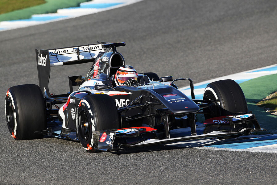
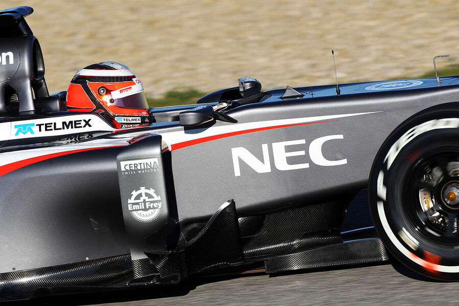
Sauber probably the best but a bit '10 HRT.
Red Bull. The flip paint just makes me think of all the chavvy sprayers at a training school near my old work. They used to all spray their Novas in the clown paint because it was cheap for them and supposedly the in thing for pretending they were Vin Diesel and Paul walker.
Merc, never liked the colour scheme it's just a dull grey and a really ugly green and that nose looks iffy.
Torro Rosso again more of the same.
LMAO - dated? REALLY?
Re: So far...
Posted: Tue Feb 05, 2013 8:24 pm
by Covalent
"LMAO" - really?
Re: So far...
Posted: Tue Feb 05, 2013 8:26 pm
by shift
this thread should be re-done with all the cars now that the line up is completed (except for Williams shape, but we have the livrery)
Re: So far...
Posted: Tue Feb 05, 2013 8:29 pm
by Johnston
JBee wrote:
LMAO - dated? REALLY?
Yip dated. They have been running the same Red and chrome since what '06?

Re: So far...
Posted: Tue Feb 05, 2013 8:38 pm
by the incubus
Johnston, perhaps you'd like to see something different but many of us LOVE the scheme just fine. That Chrome paint is simply blindingly superb any way you slice it. I prefer that Johnny Walker version with all the gradation throughout but the ones the last few years are beautiful as well. McLaren really have a knack for design.
Re: So far...
Posted: Tue Feb 05, 2013 8:45 pm
by Johnston
the incubus wrote:Johnston, perhaps you'd like to see something different but many of us LOVE the scheme just fine. That Chrome paint is simply blindingly superb any way you slice it. I prefer that Johnny Walker version with all the gradation throughout but the ones the last few years are beautiful as well. McLaren really have a knack for design.
I didn't say people didn't . But the OP was
Which one looks to be the best?
So I put my POV across it was questioned so I explained why.
Re: So far...
Posted: Tue Feb 05, 2013 8:46 pm
by Laura23
McLaren will probably change livery when Vodafone leaves at the end of 2013. New rules, new sponsor and new era most likely.
As for that Marussia, it looks like it was designed in five minutes flat by someone on the back of a napkin. Just so bland. The Caterham looks like an F1 car, the Marussia looks like someone described what an F1 car looked like to the designer over the phone.
Re: So far...
Posted: Tue Feb 05, 2013 8:47 pm
by ashley313
I think the McLaren livery is tired too. Would look good in white + rocket red w/small chrome accents.
Re: So far...
Posted: Tue Feb 05, 2013 9:20 pm
by the incubus
Laura23 wrote:McLaren will probably change livery when Vodafone leaves at the end of 2013. New rules, new sponsor and new era most likely.
As for that Marussia, it looks like it was designed in five minutes flat by someone on the back of a napkin. Just so bland. The Caterham looks like an F1 car, the Marussia looks like someone described what an F1 car looked like to the designer over the phone.
LOLOLOL
ashley313 wrote:I think the McLaren livery is tired too. Would look good in white + rocket red w/small chrome accents.
Nah, been there done that. Would be nice to see a return of colors we've not seen in a while, Orange (FI is yuck so I discount it altogether), Yellow, Baby Blue (Mild Seven Renault - Splooge!!!), Purple, Gold. Having said that, McLaren would do a white scheme unlike that rather blah one of Brawn in 2009. The other thing I'd LOVE to see is a return of some vintage sponsors that are still involved heavily in many other disciplines of racing, STP, ELF, (both baby blue

), Repsol, Canon, Benetton, Mobil, Exxon, Penzoil, Gulf, Colas, and many more. The difficulty is getting all of them to commit so much money. But I think it would refresh the grid a bit. I can imagine Coca-Cola, followed swiftly by Pepsi and so on. That's how big tobacco got involved. One guy brought one brand as a sponsor and an advertising war ensued. The same thing can happen again but it will take one of the big boys bringing in a real heavyweight to open the floodgates once again for their competitors to try and get their brand plastered on other cars.


