Page 3 of 3
Re: F1 logo to change in 2018
Posted: Wed Nov 29, 2017 8:25 am
by Exediron
Blake wrote:Define "iconic" in this context for me pleased. How can we be so positive that the new logo won't be "iconic" in a few years? What is it that makes the old logo "iconic"?
Personally, I agree with Braun... the current logo is not memorable....if it it is "iconic" it is likely do more to longevity and familiarity than great design.
Instantly recognizable? Unquestionably associated with F1?
Yes, I'm sure being around for twenty years had a lot to do with it - but why throw that away? The old logo had recognition, and just looking at it said 'racing series'. The new one means nothing; it doesn't read as F1 to most people I've talked to (and certainly not to me), and it doesn't have any recognition yet. At best it will build itself back up to the point where the old logo already was.
I strongly disagree that the previous logo was not memorable, and I strongly disagree that this one is. It looks like any other bland, overly rounded and simplified logo of the social media age.
Re: F1 logo to change in 2018
Posted: Wed Nov 29, 2017 8:46 am
by MistaVega23
My F1 app logo changed over to the new one this morning, luckily it's right next to my MotoGP app and comparing the two I feel that just adding a chequered flag or something else around it would give it some identity of a racing series, and not just another logo for a local air conditioning company.
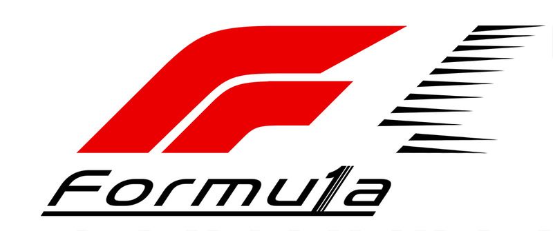
I also still think they should take a slice out of the '1' to make it look more like a number, and not an 'I'.
Re: F1 logo to change in 2018
Posted: Wed Nov 29, 2017 9:35 am
by Fantaribo
Herb Tarlik wrote:Blake wrote:I guess i'll be the exception and say that I prefer the NEW logo over the old one. I am not necessarily fond of the font they chose though. Personally, I have never been fond of the current F1 logo... not sure what so many of you like in it, but to each his own.
I never gave the old logo much thought, but now that I have seen this new abomination, I think the old one is not that bad.
The new logo looks like it was designed by a high schooler, and not a particularly talented one at that.
Designing an apparently simple logo is NOT easy. A lot of thoughts goes into it.
Re: F1 logo to change in 2018
Posted: Wed Nov 29, 2017 11:35 am
by Herb Tarlik
Exediron wrote:
I strongly disagree that the previous logo was not memorable, and I strongly disagree that this one is. It looks like any other bland, overly rounded and simplified logo of the social media age.
Completely right. 100% spot on.
The new logo is utterly generic.
Re: F1 logo to change in 2018
Posted: Wed Nov 29, 2017 12:03 pm
by MistaVega23
Decided to have a go myself using Paint. I kept the white line going across into the '1' to give the illusion of speed and cropped some edges out. I'll let you decide!
 Source: Liberty and me
 Source: Liberty and me
I won't even try and change the font...
Re: F1 logo to change in 2018
Posted: Wed Nov 29, 2017 12:14 pm
by P-F1 Mod
The bottom one is a distinct improvement for me, I have to admit. And it's a remarkably simply fix.
Re: F1 logo to change in 2018
Posted: Wed Nov 29, 2017 3:56 pm
by minchy
P-F1 Mod wrote:The bottom one is a distinct improvement for me, I have to admit. And it's a remarkably simply fix.
Yep, MistaVega's 2nd logo looks so much better than the official.
Re: F1 logo to change in 2018
Posted: Thu Nov 30, 2017 1:22 am
by F1 MERCENARY
MistaVega23 wrote:Decided to have a go myself using Paint. I kept the white line going across into the '1' to give the illusion of speed and cropped some edges out. I'll let you decide!
Source: Liberty and me
Source: Liberty and me
I won't even try and change the font...
What liberty have done is essentially kill off the iconic logo that is recognized globally in one fail swoop and that is totally NOT what to do in Branding 101.
The most notorious global brand that has totally changed it's logo completely without it being felt all that much is Pepsi. However, the way they went about it is the proper way in that they gradually made minimal changes to certain elements here and there leading into the next iteration of their logo until it was close enough that the new logo could be introduced and since it was so similar to the final evolution of the previous one, it always felt like it fit, like it was right, because it felt familiar. That is how it should be done and Liberty failed miserably in achieving or even trying to transition into a new logo.
Being as I have been a production manager who has worked with countless talented designers, I've pretty much seen every style and way of thinking, and I have amassed a wealth of different approaches from which to analyze things in way where I can see where something is lacking or needed and as such I set out to show you guys what we would have all likely been very pleased with. Hope you all like.
Version 1 is straight forward, and evolution or marriage if this new concept with the previous one we all know and love.
 Version 2
 takes things a tad further in the wordtype portion of the logo continuing with the supposed lines in the F signifying 2 cars coming around a corner to the finish line, only mine also communicates speed as well as 3 cars instead of 2. I realize wordtype should carry all the way over to be flush with the upper set of speed streaks of the one, but I have a 4-page article I need to turn in first thing in the morning so I leave it to you guys to see what I mean.
Now go bitch and moan to the FIA & Liberty to change it to one of these! LOL
Re: F1 logo to change in 2018
Posted: Thu Nov 30, 2017 1:48 am
by Exediron
F1 MERCENARY wrote:Version 1 is straight forward, and evolution or marriage if this new concept with the previous one we all know and love.
I actually prefer the first version, although I like what you were starting with the 1 in the second version. Either mockup is instantly better than what they really did, and best of all, it actually reads as F1!
Re: F1 logo to change in 2018
Posted: Thu Nov 30, 2017 5:00 am
by F1 MERCENARY
The biggest issue with the official logo is that the F and the 1 are the same color and register as a singular element (plus the font is god awful).
The lack of differentiation between the letter and the number 1 prevent people from seeing the F and the 1 and thus the casual observer will likely never see a letter and a number. The previous one and what I did creates a separation that allows the brain to immediately register there's something more to this than just some random shapes.
I think I'm going to forward these to Liberty and see if they can't bring themselves to entertain making revisions given the overwhelming negative reception the new logo has received. it's a longshot because more often than not bigwigs have chips on their shoulders and feel any advise is an insult to their intelligence.
Re: F1 logo to change in 2018
Posted: Thu Nov 30, 2017 11:37 am
by RaggedMan
F1 MERCENARY wrote:MistaVega23 wrote:Decided to have a go myself using Paint. I kept the white line going across into the '1' to give the illusion of speed and cropped some edges out. I'll let you decide!
Source: Liberty and me
Source: Liberty and me
I won't even try and change the font...
What liberty have done is essentially kill off the iconic logo that is recognized globally in one fail swoop and that is totally NOT what to do in Branding 101.
The most notorious global brand that has totally changed it's logo completely without it being felt all that much is Pepsi. However, the way they went about it is the proper way in that they gradually made minimal changes to certain elements here and there leading into the next iteration of their logo until it was close enough that the new logo could be introduced and since it was so similar to the final evolution of the previous one, it always felt like it fit, like it was right, because it felt familiar. That is how it should be done and Liberty failed miserably in achieving or even trying to transition into a new logo.
Being as I have been a production manager who has worked with countless talented designers, I've pretty much seen every style and way of thinking, and I have amassed a wealth of different approaches from which to analyze things in way where I can see where something is lacking or needed and as such I set out to show you guys what we would have all likely been very pleased with. Hope you all like.
Version 1 is straight forward, and evolution or marriage if this new concept with the previous one we all know and love.
Version 2 takes things a tad further in the wordtype portion of the logo continuing with the supposed lines in the F signifying 2 cars coming around a corner to the finish line, only mine also communicates speed as well as 3 cars instead of 2. I realize wordtype should carry all the way over to be flush with the upper set of speed streaks of the one, but I have a 4-page article I need to turn in first thing in the morning so I leave it to you guys to see what I mean.
Now go bitch and moan to the FIA & Liberty to change it to one of these! LOL
Sorry, but the "F" looks to me like "FR" in both of those and reusing the "whitespace 1" that was apparently lost on a lot of people is lazy.
Re: F1 logo to change in 2018
Posted: Thu Nov 30, 2017 2:00 pm
by Fantaribo
F1 MERCENARY wrote:MistaVega23 wrote:Decided to have a go myself using Paint. I kept the white line going across into the '1' to give the illusion of speed and cropped some edges out. I'll let you decide!
Source: Liberty and me
Source: Liberty and me
I won't even try and change the font...
What liberty have done is essentially kill off the iconic logo that is recognized globally in one fail swoop and that is totally NOT what to do in Branding 101.
The most notorious global brand that has totally changed it's logo completely without it being felt all that much is Pepsi. However, the way they went about it is the proper way in that they gradually made minimal changes to certain elements here and there leading into the next iteration of their logo until it was close enough that the new logo could be introduced and since it was so similar to the final evolution of the previous one, it always felt like it fit, like it was right, because it felt familiar. That is how it should be done and Liberty failed miserably in achieving or even trying to transition into a new logo.
Being as I have been a production manager who has worked with countless talented designers, I've pretty much seen every style and way of thinking, and I have amassed a wealth of different approaches from which to analyze things in way where I can see where something is lacking or needed and as such I set out to show you guys what we would have all likely been very pleased with. Hope you all like.
Version 1 is straight forward, and evolution or marriage if this new concept with the previous one we all know and love.
Version 2 takes things a tad further in the wordtype portion of the logo continuing with the supposed lines in the F signifying 2 cars coming around a corner to the finish line, only mine also communicates speed as well as 3 cars instead of 2. I realize wordtype should carry all the way over to be flush with the upper set of speed streaks of the one, but I have a 4-page article I need to turn in first thing in the morning so I leave it to you guys to see what I mean.
Now go bitch and moan to the FIA & Liberty to change it to one of these! LOL
Sorry, but imo the official one is much better.
Re: F1 logo to change in 2018
Posted: Thu Nov 30, 2017 2:05 pm
by Bentrovato
Fantaribo wrote:
Sorry, but imo the official one is much better.
I disagree. Stop whining that you don't like the new images created by our forum members, they are much better than Liberty's offerings!
Re: F1 logo to change in 2018
Posted: Thu Nov 30, 2017 2:17 pm
by Fantaribo
Bentrovato wrote:Fantaribo wrote:
Sorry, but imo the official one is much better.
I disagree. Stop whining that you don't like the new images created by our forum members, they are much better than Liberty's offerings!
No, they are not better. You
think they are better : it is different.
Re: F1 logo to change in 2018
Posted: Thu Nov 30, 2017 2:32 pm
by Blake
Bentrovato wrote:Fantaribo wrote:
Sorry, but imo the official one is much better.
I disagree. Stop whining that you don't like the new images created by our forum members, they are much better than Liberty's offerings!
With all due respect to our forumite's designs, it is the right of amy of our members to not like them as well as the new logo or the old on. Who are you to tell a member to "stop whining" because he/she doesn't agree with your opinion?
Re: F1 logo to change in 2018
Posted: Thu Nov 30, 2017 3:54 pm
by F1 MERCENARY
RaggedMan wrote:F1 MERCENARY wrote:MistaVega23 wrote:Decided to have a go myself using Paint. I kept the white line going across into the '1' to give the illusion of speed and cropped some edges out. I'll let you decide!
Source: Liberty and me
Source: Liberty and me
I won't even try and change the font...
What liberty have done is essentially kill off the iconic logo that is recognized globally in one fail swoop and that is totally NOT what to do in Branding 101.
The most notorious global brand that has totally changed it's logo completely without it being felt all that much is Pepsi. However, the way they went about it is the proper way in that they gradually made minimal changes to certain elements here and there leading into the next iteration of their logo until it was close enough that the new logo could be introduced and since it was so similar to the final evolution of the previous one, it always felt like it fit, like it was right, because it felt familiar. That is how it should be done and Liberty failed miserably in achieving or even trying to transition into a new logo.
Being as I have been a production manager who has worked with countless talented designers, I've pretty much seen every style and way of thinking, and I have amassed a wealth of different approaches from which to analyze things in way where I can see where something is lacking or needed and as such I set out to show you guys what we would have all likely been very pleased with. Hope you all like.
Version 1 is straight forward, and evolution or marriage if this new concept with the previous one we all know and love.
Version 2 takes things a tad further in the wordtype portion of the logo continuing with the supposed lines in the F signifying 2 cars coming around a corner to the finish line, only mine also communicates speed as well as 3 cars instead of 2. I realize wordtype should carry all the way over to be flush with the upper set of speed streaks of the one, but I have a 4-page article I need to turn in first thing in the morning so I leave it to you guys to see what I mean.
Now go bitch and moan to the FIA & Liberty to change it to one of these! LOL
Sorry, but the "F" looks to me like "FR" in both of those and reusing the "whitespace 1" that was apparently lost on a lot of people is lazy.
You may not like what I did it but the re-purposing of the negative space in in fact NOT lazy, but a calculated inclusion for the very reasons I stated.
To depart completely from what has been your brand icon to something totally new and more importantly different, bearing no resemblance to and/or have no tie-in to the previous one is not the way to do things. As such I took a the New and tied in a bit of the previous one so the association with the previous icon is immediate and it achieves that 100%, regardless of what other things you see when you're looking to analyze and critique.
The thing here is that this thread is speaking specifically about the logo that has been introduced as the new official one for Formula 1 and as such you're going to look for anything and everything to nitpick at and because that's the level at which you have your brain set to. Being as the new "F" is likely what we're stuck with, my goal was to make it better. And from the tightened up "F" Icon to the Font ans the use of color mine trumps the official one, but like everything else, nothing will ever appeal to everyone equally and I'm fine with that, but the notion that what I did was in any way lazy is absurd.
Re: F1 logo to change in 2018
Posted: Thu Nov 30, 2017 4:26 pm
by Covalent
How would it look in all red?
Re: F1 logo to change in 2018
Posted: Thu Nov 30, 2017 7:22 pm
by F1 MERCENARY
It's ok and works just as well as the previous one but this 2-colr version helps drive the point that each element communicates a different element.
In this case the F represnts Formula, the Negative space represents One, and the black represents Speed.
It's pretty much what the previous logo accomplished.
Re: F1 logo to change in 2018
Posted: Thu Nov 30, 2017 7:23 pm
by RaggedMan
F1 MERCENARY wrote:RaggedMan wrote:F1 MERCENARY wrote:MistaVega23 wrote:Decided to have a go myself using Paint. I kept the white line going across into the '1' to give the illusion of speed and cropped some edges out. I'll let you decide!
Source: Liberty and me
Source: Liberty and me
I won't even try and change the font...
What liberty have done is essentially kill off the iconic logo that is recognized globally in one fail swoop and that is totally NOT what to do in Branding 101.
The most notorious global brand that has totally changed it's logo completely without it being felt all that much is Pepsi. However, the way they went about it is the proper way in that they gradually made minimal changes to certain elements here and there leading into the next iteration of their logo until it was close enough that the new logo could be introduced and since it was so similar to the final evolution of the previous one, it always felt like it fit, like it was right, because it felt familiar. That is how it should be done and Liberty failed miserably in achieving or even trying to transition into a new logo.
Being as I have been a production manager who has worked with countless talented designers, I've pretty much seen every style and way of thinking, and I have amassed a wealth of different approaches from which to analyze things in way where I can see where something is lacking or needed and as such I set out to show you guys what we would have all likely been very pleased with. Hope you all like.
Version 1 is straight forward, and evolution or marriage if this new concept with the previous one we all know and love.
Version 2 takes things a tad further in the wordtype portion of the logo continuing with the supposed lines in the F signifying 2 cars coming around a corner to the finish line, only mine also communicates speed as well as 3 cars instead of 2. I realize wordtype should carry all the way over to be flush with the upper set of speed streaks of the one, but I have a 4-page article I need to turn in first thing in the morning so I leave it to you guys to see what I mean.
Now go bitch and moan to the FIA & Liberty to change it to one of these! LOL
Sorry, but the "F" looks to me like "FR" in both of those and reusing the "whitespace 1" that was apparently lost on a lot of people is lazy.
You may not like what I did it but the re-purposing of the negative space in in fact NOT lazy, but a calculated inclusion for the very reasons I stated.
To depart completely from what has been your brand icon to something totally new and more importantly different, bearing no resemblance to and/or have no tie-in to the previous one is not the way to do things. As such I took a the New and tied in a bit of the previous one so the association with the previous icon is immediate and it achieves that 100%, regardless of what other things you see when you're looking to analyze and critique.
The thing here is that this thread is speaking specifically about the logo that has been introduced as the new official one for Formula 1 and as such you're going to look for anything and everything to nitpick at and because that's the level at which you have your brain set to. Being as the new "F" is likely what we're stuck with, my goal was to make it better. And from the tightened up "F" Icon to the Font ans the use of color mine trumps the official one, but like everything else, nothing will ever appeal to everyone equally and I'm fine with that, but the notion that what I did was in any way lazy is absurd.
It's hard to tell from the phrasing in the first sentence of the second paragraph if you're talking about people being nitpicky about the new logo, or my criticism your renderings. If the later is the case I don't know where you're getting me being nitpicky from.
If you showed me the logos you did without the actual words beneath them and told me it was a new logo for a racing series my first thought would be Formula Renault because the way you changed the F now makes it look like a capital F with a lower case r nestled underneath.
As far as the negative space 1 from the old logo being incorporated goes perhaps not lazy but rather nostalgic. You think that feature was part of what made the old logo iconic but the fact that it's been around for 30 years and many long term fans didn't realized until this discussion that was there means that it's not nearly as iconic as you think.
This isn't meant as a critique of your skills or ability just my opinion on your modifications of the new official logo and why I don't think they deliver an improvement.
Re: F1 logo to change in 2018
Posted: Fri Dec 01, 2017 1:37 am
by Randine
The best re-hash I have seen is this one.
https://i.redd.it/dbg098vvlc001.png
https://www.reddit.com/r/formula1/comme ... d_f1_logo/
And as for variations on the new one, I like that this one has more closely shows a racing line vs the side by side oval racing of the new official one.

Re: F1 logo to change in 2018
Posted: Fri Dec 01, 2017 2:59 am
by Alienturnedhuman
In the F1 reddit I found a link to a series of wallpapers someone had made with the new logo, which does actually show some versatility to it:
https://imgur.com/a/RzbFq
However, then in the reddit thread, there was a link to this article about the design of the new logo and the philosophy (interestingly, the design agency did try updating the previous logo design)
https://www.creativereview.co.uk/formul ... dy-london/
The article does features photos of pages showing many many different logo designs they came up with during the process.
Re: F1 logo to change in 2018
Posted: Fri Dec 01, 2017 10:55 am
by Fantaribo
Alienturnedhuman wrote:In the F1 reddit I found a link to a series of wallpapers someone had made with the new logo, which does actually show some versatility to it:
https://imgur.com/a/RzbFq
However, then in the reddit thread, there was a link to this article about the design of the new logo and the philosophy (interestingly, the design agency did try updating the previous logo design)
https://www.creativereview.co.uk/formul ... dy-london/
The article does features photos of pages showing many many different logo designs they came up with during the process.
This could explain to some people the whole extent that this logo change implies. This is not just a logo printed on some adverts, flyers, or TV screen, it goes way further than this. The whole visual identity changes.
This agency was tasked to create a new one for F1, and imo the example images provided are quite impressive. People have to understand that the old F1 visual identity lacked consistency and uniqueness, something that has to be corrected by creating a whole visual ecosystem, much like an operating system, e.g. iOS.
The main mistake here is that it has been announced as a logo change.
Re: F1 logo to change in 2018
Posted: Fri Dec 01, 2017 11:11 am
by Randine
Fantaribo wrote:Alienturnedhuman wrote:In the F1 reddit I found a link to a series of wallpapers someone had made with the new logo, which does actually show some versatility to it:
https://imgur.com/a/RzbFq
However, then in the reddit thread, there was a link to this article about the design of the new logo and the philosophy (interestingly, the design agency did try updating the previous logo design)
https://www.creativereview.co.uk/formul ... dy-london/
The article does features photos of pages showing many many different logo designs they came up with during the process.
This could explain to some people the whole extent that this logo change implies. This is not just a logo printed on some adverts, flyers, or TV screen, it goes way further than this. The whole visual identity changes.
This agency was tasked to create a new one for F1, and imo the example images provided are quite impressive. People have to understand that the old F1 visual identity lacked consistency and uniqueness, something that has to be corrected by creating a whole visual ecosystem, much like an operating system, e.g. iOS.
The main mistake here is that it has been announced as a logo change.
Yes that might be true, but the logo is the most significant part of it.
They have failed in that respect. The old logo was identifiable at any size.
It seems that there is 2 versions of the new logo.
The long drawn out F with noticeably thin lines (as shown on the screens behind the drivers on the podium) vs the shorter version with thicker lines for when using the logo small. Massive fail if they need 2 different logos for different purposes.
One just has to look at the footer of the F1 website to see how small they could take the old logo yet have it still be crystal clear.
Re: F1 logo to change in 2018
Posted: Fri Dec 01, 2017 11:53 am
by Ennis
The more I see it, the more I like it. So
Re: F1 logo to change in 2018
Posted: Fri Dec 01, 2017 2:19 pm
by RaggedMan
Alienturnedhuman wrote:In the F1 reddit I found a link to a series of wallpapers someone had made with the new logo, which does actually show some versatility to it:
https://imgur.com/a/RzbFq
However, then in the reddit thread, there was a link to this article about the design of the new logo and the philosophy (interestingly, the design agency did try updating the previous logo design)
https://www.creativereview.co.uk/formul ... dy-london/
The article does features photos of pages showing many many different logo designs they came up with during the process.
That second link is pretty good. Some of those logos in the booklet are truly awful.
I hope that they don't use that font for onscreen graphics during races. It's okay at best for printed material but not crisp enough for viewing on screen from a distance in my opinion. And the "F1 Torque" font looks too much like the Star Wars font.
Re: F1 logo to change in 2018
Posted: Fri Dec 01, 2017 3:25 pm
by F1 MERCENARY
Alienturnedhuman wrote:In the F1 reddit I found a link to a series of wallpapers someone had made with the new logo, which does actually show some versatility to it:
https://imgur.com/a/RzbFq
However, then in the reddit thread, there was a link to this article about the design of the new logo and the philosophy (interestingly, the design agency did try updating the previous logo design)
https://www.creativereview.co.uk/formul ... dy-london/
The article does features photos of pages showing many many different logo designs they came up with during the process.
If by versatility you mean the incorporation of team colors into it, then no. That's called bastardization of a logo and is a huge No-No and most corporations issue specific guidelines as to what can be done with the logo and particularly how it can be use, and then go as far as to show what is not allowed to be done with them and where they can and cannot be used. The first thing you cannot do is apply colors that are not listed within the guidelines so teams colorizing the logo to match their sponsorship livery will most likely not be allowed, unless expressly approved by F1. I wouldn't be surprised to learn they'll get the green light to do so, but one cannot assume they have creative freedom to do so without prior approval.
The agency did a gherkin poor job of conceptualizing a good variety of solid designs from which to choose because as stated, most of them are dreadfully un-presentable.
In regards to updating, that's not as easy as people may think and often, having to modify an already existing design usually proves far more difficult than simply starting from scratch. Even reworking simple paths around images usually takes longer to tweak and adjust to the image than just starting a brand new one that follows correctly.Having said all this, the Weiden-Kennedy agency has done some UHHHMAZING things over the years, but Logo design isn't their strong suit and I think their concept book for this project really shows that well.
I will admit though, this logo is slowly growing on me and W-K are doing a pretty good job with the design of the merchandise and I have to admit the logo looks particularly good on the black helmet. The element on the white baseball cap at the top and on the white sT-shirt on the bottom is one that certainly communicates speed and perhaps they could/should have built off that.
http://wklondon.com/work/formula-1/
Re: F1 logo to change in 2018
Posted: Fri Dec 01, 2017 3:31 pm
by F1 MERCENARY
Fantaribo wrote:This could explain to some people the whole extent that this logo change implies. This is not just a logo printed on some adverts, flyers, or TV screen, it goes way further than this. The whole visual identity changes.
This agency was tasked to create a new one for F1, and imo the example images provided are quite impressive. People have to understand that the old F1 visual identity lacked consistency and uniqueness, something that has to be corrected by creating a whole visual ecosystem, much like an operating system, e.g. iOS.
The main mistake here is that it has been announced as a logo change.
BIB…
Sorry that's completely untrue in every regard. If you went on to f1.com the logo and brand identity was flawlessly applied and carried through the entire site no matter what page or where you clicked. There wasn't a stone left unturned and believe me, I looked hard. LOL
Therefore the bit in Italics holds no water because nothing in terms of branding needed to be corrected. Sadly when people read posts like yours they tend to buy into it and that's how internet rumors get started.
Re: F1 logo to change in 2018
Posted: Fri Dec 01, 2017 5:59 pm
by F1 MERCENARY
Since we're talking about logos, PF'1 logo (or lack there of) could use an update. As such I took the liberty of creating one for you guys.
Something simple and to the point, but feel free to pick it apart.
Re: F1 logo to change in 2018
Posted: Fri Dec 01, 2017 6:05 pm
by Warheart01
Not that I care but it's [rubbish]This is a step back and the old one was much more modern and fitting.
Re: F1 logo to change in 2018
Posted: Thu Dec 14, 2017 7:35 pm
by slide
well I for one am excited about the new logo and the new 2018 season , It should really help bringing in new fans from around the world and will deffinately improve the racing -they were thinking along the lines of reducing the penalties but time was short as the fantastic new logo took some time , but I think you will agree the new owners have been working hard on the important issues first, and the latest thing is the grid girls , oh yes another major issue the new owners have their minds on and are prepared to act to improve the sport ,
I feel the sport is moving in the right direction now
Re: F1 logo to change in 2018
Posted: Fri Dec 15, 2017 1:21 pm
by SteveW
slide wrote:well I for one am excited about the new logo and the new 2018 season , It should really help bringing in new fans from around the world and will deffinately improve the racing -they were thinking along the lines of reducing the penalties but time was short as the fantastic new logo took some time , but I think you will agree the new owners have been working hard on the important issues first, and the latest thing is the grid girls , oh yes another major issue the new owners have their minds on and are prepared to act to improve the sport ,
I feel the sport is moving in the right direction now
I read somewhere that they are also entering into a dialogue with the Liberty Media office staff to ensure that they each only use one pack of Post-It notes per year, which could save some money to be distributed among the teams. This has the potential to offset the revenue the teams will lose due to the "investment" Liberty have already made.......
[/sarcasm]
Re: F1 logo to change in 2018
Posted: Fri Dec 15, 2017 9:14 pm
by slide
apparently max is very disappointed the grid girls might be going and has got a little notebook and one of those biro pens that has 4 different colours that individually clip down ,red , green , blue , and..... black
Re: F1 logo to change in 2018
Posted: Sat Dec 30, 2017 3:19 pm
by MB-BOB
I've followed Formula 1 for more than 50 years, recording all but 3 races since 1982.
I've never cared what the logo looked like. Still don't care.
Re: F1 logo to change in 2018
Posted: Sun Jan 07, 2018 11:26 am
by dukieboy
chicane number 1

Re: F1 logo to change in 2018
Posted: Mon Jan 15, 2018 9:40 pm
by F1 MERCENARY
So it looks like a change may be on the cards for this "NEW" [COUGHPlagiarized!!] Logo…
https://wtf1.com/post/f1-could-be-about ... medium=rss
This is also all too common in the industry. People do "research" and when they see something that appeals to them, the "borrow", sometimes rather heavily, and this seems to be one of those instances.

Re: F1 logo to change in 2018
Posted: Tue Jan 16, 2018 3:05 am
by Alienturnedhuman
F1 MERCENARY wrote:So it looks like a change may be on the cards for this "NEW" [COUGHPlagiarized!!] Logo…
https://wtf1.com/post/f1-could-be-about ... medium=rss
This is also all too common in the industry. People do "research" and when they see something that appeals to them, the "borrow", sometimes rather heavily, and this seems to be one of those instances.
It's extremely unlikely this will lead to the F1 logo changing. The products are in very divergent markets, however trademark and copyright laws require that you aggressive defend them to avoid more similar cases.
Even if the courts were to decide this was infringement, given that the F1 logo is the flagship logo for the main brand, and Futuro is just a minor product in 3M's range of products, it would be far more likely for F1 to pay damages and acquire the rights to it rather than to suffer the indignity of rebranding so soon after a rebrand.
Re: F1 logo to change in 2018
Posted: Tue Jan 16, 2018 5:02 pm
by F1 MERCENARY
All depends on who is leading the charge in the lawsuit and what 3M want to come of it. Knowing how no-nonsense 3M has been throughout its history, they are pretty aggressive in defending their IP's. 3M is as Teflon as Bernie has been and they have DEEEEEP Pockets so I'll just wait to see how it all unfolds.
I know if the shoe was on the other foot, F1 and the FIA would go for blood.
Re: F1 logo to change in 2018
Posted: Wed Jan 17, 2018 6:32 pm
by slide
would it not be easier to stick to what they presently have , why waste money on a new name just to put your stamp on it , if its not broken don't change it - changing the logo is not the most pressing job now is it