Page 2 of 3
Re: F1 logo to change in 2018
Posted: Sun Nov 26, 2017 3:12 pm
by Randine
BlackSG5 wrote:Looks more like FI than F1. Force India?
My thoughts exactly.
That doesn’t even look like an F. And the 1 looks like an i.
I am not a designer but owned a graphic design agency for 15 years. The old logo was fantastic for its clever use of having the F and 1 fit together.
If they modernised that design, it could have been really good.
Liberty could have also thrown the design out to the public, just like Lewis did with his helmet design.
It could have generated quite a bit of publicity for F1 on social media.
The new design looks amateurish, outdated and confusing. Without the words Formula One written underneath it, you would have zero idea what it was for.
Re: F1 logo to change in 2018
Posted: Sun Nov 26, 2017 3:30 pm
by Ennis
100% looks like something from wipeOut.
Re: F1 logo to change in 2018
Posted: Sun Nov 26, 2017 3:33 pm
by j man
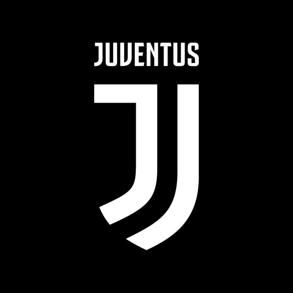
Was this done by the same people who came up with the terrible new Juventus FC logo? The concept appears strikingly similar to me.
 https://www.underconsideration.com/bran ... s_logo.png
Re: F1 logo to change in 2018
Posted: Sun Nov 26, 2017 3:37 pm
by jimmyj
Gosh the new logo is horrendous.
Re: F1 logo to change in 2018
Posted: Sun Nov 26, 2017 4:02 pm
by UnlikeUday
Re: F1 logo to change in 2018
Posted: Sun Nov 26, 2017 4:49 pm
by kls2020
In keeping up with the times the new logo should have featured "F1" protected by an upper case "Y" super imposed over it for 2018
Re: F1 logo to change in 2018
Posted: Sun Nov 26, 2017 8:53 pm
by Herb Tarlik
God the new logo is simply horrible; perfect for the start of the halo era next year.
Re: F1 logo to change in 2018
Posted: Sun Nov 26, 2017 9:29 pm
by P-F1 Mod
Looks like it was rendered by our servers...
Re: F1 logo to change in 2018
Posted: Sun Nov 26, 2017 11:03 pm
by Exediron
It's poor. I honestly don't see a single thing to recommend it over the old one, which was far better.
Re: F1 logo to change in 2018
Posted: Mon Nov 27, 2017 1:11 pm
by Randine
With the halo, 3 engines, grid penalties, inconsistent stewarding, and now this ugly new logo, I am seriously thinking of giving up watching F1 after 35 years.
My brother doesn’t watch anymore. Neither does my dad. Both used to be very passionate and they got me into the sport.
Re: F1 logo to change in 2018
Posted: Mon Nov 27, 2017 1:15 pm
by Zoue
Randine wrote:With the halo, 3 engines, grid penalties, inconsistent stewarding, and now this ugly new logo, I am seriously thinking of giving up watching F1 after 35 years.
My brother doesn’t watch anymore. Neither does my dad. Both used to be very passionate and they got me into the sport.
I'm with you on the three engines, grid penalties and inconsistent stewarding. But why would a logo put you off watching F1?
Re: F1 logo to change in 2018
Posted: Mon Nov 27, 2017 1:17 pm
by SteveW
I had high hopes when Liberty took over F1.
If this logo is an indication of the standard of other "improvements" they are planning to make, I have a feeling I am going to end up somewhat underwhelmed/disappointed.......
I work in IT and have done for well over 25 years now, so I'm not averse to change in any way - apart from changing things purely for the sake of it. And this is exactly that. But it's a step backwards in my opinion.

Re: F1 logo to change in 2018
Posted: Mon Nov 27, 2017 1:22 pm
by MistaVega23
If they took a slice out of the top left corner of the '1' then it'll look slightly better. I'm sure someone here can do a little editing...
Reminds me of a logo for a lower formula.
Re: F1 logo to change in 2018
Posted: Mon Nov 27, 2017 1:23 pm
by tootsie323
If you look closely you'll make out a backwards h in the logo. I'm making no claim to any relevance of that whatsoever.
Anyway, my personal opinion of could-be-worse isn't exactly a ringing endorsement!
Re: F1 logo to change in 2018
Posted: Mon Nov 27, 2017 1:52 pm
by Mort Canard
It's a very stylish solution to a problem that didn't exist.
The way things are going, I am wondering if Liberty Media is going to have to try and link themselves to the past decades of glory by this time next year in order to shore up their fading fortunes.
Re: F1 logo to change in 2018
Posted: Tue Nov 28, 2017 6:24 am
by Randine
Zoue wrote:Randine wrote:With the halo, 3 engines, grid penalties, inconsistent stewarding, and now this ugly new logo, I am seriously thinking of giving up watching F1 after 35 years.
My brother doesn’t watch anymore. Neither does my dad. Both used to be very passionate and they got me into the sport.
I'm with you on the three engines, grid penalties and inconsistent stewarding. But why would a logo put you off watching F1?
Ha, yeah might seem a bit over the top. However feel like the straw that broke the camels back type of thing.
I have read some rubbish about the new logo (from the designer) and how it is like 2 cars crossing a finish line. Well they didn't even hit the apex in that final corner...


I guess just before every race I will get that bloody ugly logo flashed up which will remind me of all the stupid changes Liberty have done recently.
Change is good sometimes, however it is more pain than gain right now. And change can also alienate an existing fan base.
Kids these days would rather watch any other dangerous sport like motocross, skateboarding, snowboarding, x games etc etc.
F1 was the pinnacle, the best, unmatched in prestige and history.
And now it is represented by a 3rd rate logo that looks like it belongs on a Sega Mega Drive game...
Re: F1 logo to change in 2018
Posted: Tue Nov 28, 2017 9:34 am
by Biffa
I predict that it will be like The Chain. In a few years someone else will take over in senior management, and in an effort to return F1 to its former success will reintroduce the old logo, and us older members of the forum will breathe a sigh of relief

Re: F1 logo to change in 2018
Posted: Tue Nov 28, 2017 10:09 am
by Fantaribo
I don't mind the new logo, really. Everything else about the visual identity changed, so the old logo was outdated.
Re: F1 logo to change in 2018
Posted: Tue Nov 28, 2017 11:53 am
by Herb
Fantaribo wrote:I don't mind the new logo, really. Everything else about the visual identity changed, so the old logo was outdated.
I don't understand the hate for the new logo - it looks OK, maybe not as good as the old one, but certainly feels more modern to me. It's just not worth getting wound up about.
Re: F1 logo to change in 2018
Posted: Tue Nov 28, 2017 1:40 pm
by Herb Tarlik
Randine wrote:
F1 was the pinnacle, the best, unmatched in prestige and history.
And now it is represented by a 3rd rate logo that looks like it belongs on a Sega Mega Drive game...
It's amazing how far Formula One has fallen. The hybrid engine era has been an unmitigated disaster. Watching the NFL implode upon itself seems distinctly familiar as an F1 fan.
I guess every person who grows old looks back at certain times with immense fondness. I never knew how good I had it watching F1 during the Senna/Prost era. Those times were amazing, and it seemed impossible that such incredible men and machines would become a thing of the past. We'll never get back things like: beautifully streamlined cars like the McLaren MP4/8, cars where you could actually see the drivers, manual gear boxes that made drivers work hard, V-10/12 engines that scream like nothing else on the planet, a grid loaded with teams that were 100% race driven, not offshoots of multibillion dollar transglobal corporations.
We've lost a lot but gained very little.
Well, time to be thankful that I was able to be a part of those times, because they were indeed very much incredible. The 3.5 and 3.0 liter era was simply amazing. Some of the greatest memories of my life were spent at race tracks populated by cars with those engines or even just getting up before dawn to watch them on TV. I just wish I could have shared those times with my son, that would have capped it off perfectly.
Re: F1 logo to change in 2018
Posted: Tue Nov 28, 2017 1:42 pm
by Herb Tarlik
Randine wrote:With the halo, 3 engines, grid penalties, inconsistent stewarding, and now this ugly new logo, I am seriously thinking of giving up watching F1 after 35 years.
My brother doesn’t watch anymore. Neither does my dad. Both used to be very passionate and they got me into the sport.
Most of my friends stopped watching Formula One once we hit the hybrid era. They follow the race winners, but never, ever watch a race. Far too boring I'm told over and over again. I don't try to argue against it. I watch simply because I always have for the past 30 years.
Re: F1 logo to change in 2018
Posted: Tue Nov 28, 2017 1:53 pm
by Seanie
Fantaribo wrote:I don't mind the new logo, really. Everything else about the visual identity changed, so the old logo was outdated.
Herb wrote:Fantaribo wrote:I don't mind the new logo, really. Everything else about the visual identity changed, so the old logo was outdated.
I don't understand the hate for the new logo - it looks OK, maybe not as good as the old one, but certainly feels more modern to me. It's just not worth getting wound up about.
I agree, the logo
isn't that bad.
I'm sure in a few weeks/months it won't be something anyone even thinks about. If it is, you're thinking about it too much and you need to move on.

Re: F1 logo to change in 2018
Posted: Tue Nov 28, 2017 1:59 pm
by Covalent
Herb Tarlik wrote:Randine wrote:With the halo, 3 engines, grid penalties, inconsistent stewarding, and now this ugly new logo, I am seriously thinking of giving up watching F1 after 35 years.
My brother doesn’t watch anymore. Neither does my dad. Both used to be very passionate and they got me into the sport.
Most of my friends stopped watching Formula One once we hit the hybrid era. They follow the race winners, but never, ever watch a race. Far too boring I'm told over and over again. I don't try to argue against it. I watch simply because I always have for the past 30 years.
Very interesting how these not at all imaginary friends of yours can tell you over and over again how boring a sport that they never ever watch is.
Re: F1 logo to change in 2018
Posted: Tue Nov 28, 2017 2:04 pm
by Covalent
It's like they're trying too hard to distance themselves from everything the old regime's come up with like some teenager rioting against their parents.
Why not just rejuvenate the old logo?
Re: F1 logo to change in 2018
Posted: Tue Nov 28, 2017 2:24 pm
by Herb Tarlik
Covalent wrote:Herb Tarlik wrote:Randine wrote:With the halo, 3 engines, grid penalties, inconsistent stewarding, and now this ugly new logo, I am seriously thinking of giving up watching F1 after 35 years.
My brother doesn’t watch anymore. Neither does my dad. Both used to be very passionate and they got me into the sport.
Most of my friends stopped watching Formula One once we hit the hybrid era. They follow the race winners, but never, ever watch a race. Far too boring I'm told over and over again. I don't try to argue against it. I watch simply because I always have for the past 30 years.
Very interesting how these not at all imaginary friends of yours can tell you over and over again how boring a sport that they never ever watch is.
Right over your head again. Not surprising.
Re: F1 logo to change in 2018
Posted: Tue Nov 28, 2017 3:09 pm
by minchy
I may be alone in thinking this, but when I saw the logo it looked more like the 'cars' in the F are actually driving away from the 1 in the logo as opposed to how the graphical artist said he designed to to look.
Re: F1 logo to change in 2018
Posted: Tue Nov 28, 2017 3:15 pm
by SteveW
Herb wrote:Fantaribo wrote:I don't mind the new logo, really. Everything else about the visual identity changed, so the old logo was outdated.
I don't understand the hate for the new logo - it looks OK, maybe not as good as the old one, but certainly feels more modern to me. It's just not worth getting wound up about.
I don't like the new logo. I wouldn't go so far as saying that I hate it, it makes little difference to me really and I certainly wouldn't stop watching a sport I have followed for over 30 years now just because the logo has changed.
I also get that changing the logo (or similar sort of changes to a business when it is taken over for example) is something that often happens.
What I don't get - and this isn't specific to this Formula One case - is the focus is on something that isn't actually a problem within the sport and they should be thinking about/spending their money on other far more important ways to improve the sport etc.
Re: F1 logo to change in 2018
Posted: Tue Nov 28, 2017 3:28 pm
by Randine
minchy wrote:I may be alone in thinking this, but when I saw the logo it looked more like the 'cars' in the F are actually driving away from the 1 in the logo as opposed to how the graphical artist said he designed to to look.
The design explanation shows that they arent familiar with F1 as it looks like 2 cars on an oval track racing side by side. (The company that did it was American, so I presume the designer was too)
At least I have 4 months to get over it. I am surprised how angry/annoyed/wound up this new logo has got me.
I would have been all for a slight tweak to modernise the old logo like Google or Starbucks has done with their logos over the years.
Re: F1 logo to change in 2018
Posted: Tue Nov 28, 2017 3:33 pm
by F1 MERCENARY
Seanie wrote:Fantaribo wrote:I don't mind the new logo, really. Everything else about the visual identity changed, so the old logo was outdated.
Herb wrote:Fantaribo wrote:I don't mind the new logo, really. Everything else about the visual identity changed, so the old logo was outdated.
I don't understand the hate for the new logo - it looks OK, maybe not as good as the old one, but certainly feels more modern to me. It's just not worth getting wound up about.
I agree, the logo
isn't that bad.
I'm sure in a few weeks/months it won't be something anyone even thinks about. If it is, you're thinking about it too much and you need to move on.
Actually it is THAT bad and to make things worse the cockamamie explanation some donkey headgear designer came up with to try and sell it is being passed onto the world.
The 2 lines depicting the F are now said to be indicative of 2 cars coming around a bend and the 1 signifies the finish line. In theory a great concept but this is clearly an afterthought or else something in the icon would resemble something associated with, well, RACING so this "concept" would register automatically and without much thought, if any. Just a crock of fairy cakes. I've sat in too many meetings where this type of BS sales pitch took place and most of the time the people paying the money felt that if it didn't look good or requires that much thought to grasp the concept, the over explanation fell on deaf ears.
The #1 rule for logo design is that it should be self explanatory to a great degree and if you have to break it down in order for everyone else to understand the concept, then you failed as a designer and you should be going back to the drawing board. I would LOVE to hear the explanation for the other 2 proposed atrocities. LOLOL
Re: F1 logo to change in 2018
Posted: Tue Nov 28, 2017 6:17 pm
by Bentrovato
The new logo is horrendous. Liberty's marketing program is a joke - who's running that sideshow? It's like they hired a marketer without F1 knowledge. You DO NOT introduce something you want to be new and exciting right after the most boring race of every year. How could you not know that?
Secondary - the new logo is bad. In this age of unlimited creative talent, the new F1 logo should be outstanding. I don't want to hear how it's supposed to resemble the new lower profile cars or how it looks more racy. Fans should look at it and like it, but instead it stinks.
Re: F1 logo to change in 2018
Posted: Tue Nov 28, 2017 7:28 pm
by Blake
I guess i'll be the exception and say that I prefer the NEW logo over the old one. I am not necessarily fond of the font they chose though. Personally, I have never been fond of the current F1 logo... not sure what so many of you like in it, but to each his own.
Re: F1 logo to change in 2018
Posted: Tue Nov 28, 2017 7:31 pm
by Fantaribo
Bentrovato wrote:The new logo is horrendous. Liberty's marketing program is a joke - who's running that sideshow? It's like they hired a marketer without F1 knowledge. You DO NOT introduce something you want to be new and exciting right after the most boring race of every year. How could you not know that?
Secondary - the new logo is bad. In this age of unlimited creative talent, the new F1 logo should be outstanding. I don't want to hear how it's supposed to resemble the new lower profile cars or how it looks more racy. Fans should look at it and like it, but instead it stinks.
I have to say that is your own opinion and I respect it, but I totally disagree. To say it is bad is patronizing and voiding our opinion. Personally, I look at it, and I kinda like it. But I see a logo, not the big fuss you are making out of it.
And you dare say you don't want to hear explanations? I'm afraid I don't want to hear you whining.
Re: F1 logo to change in 2018
Posted: Tue Nov 28, 2017 8:14 pm
by slide
what a waste of time, effort, money and why ? , just so the new owners can put their stamp on it
lets remember that the new owners took over a product that was already established , up a fully running and working very well indeed
its not as if F1 was broken and needed a restoration , because it certainly didn't need that
just a pointless exersize that will achieve nothing
so all the looking ,watching ,attending races , and looking for ways to improve the sport , and this is one of the first ideas they could up with , and implement- amazing
Re: F1 logo to change in 2018
Posted: Tue Nov 28, 2017 8:16 pm
by Bentrovato
Fantaribo wrote:Bentrovato wrote:The new logo is horrendous. Liberty's marketing program is a joke - who's running that sideshow? It's like they hired a marketer without F1 knowledge. You DO NOT introduce something you want to be new and exciting right after the most boring race of every year. How could you not know that?
Secondary - the new logo is bad. In this age of unlimited creative talent, the new F1 logo should be outstanding. I don't want to hear how it's supposed to resemble the new lower profile cars or how it looks more racy. Fans should look at it and like it, but instead it stinks.
I have to say that is your own opinion and I respect it, but I totally disagree. To say it is bad is patronizing and voiding our opinion. Personally, I look at it, and I kinda like it. But I see a logo, not the big fuss you are making out of it.
And you dare say you don't want to hear explanations? I'm afraid I don't want to hear you whining.
I definitely didn't mean I didn't want to hear explanations from other people here. It was more about Liberty having to come out and explain to the people what the logo is, which defeats the purpose of the logo. I think if the logo was nice, there would be a lot more people complementing it - but since there is a lot of negativity around it, maybe they could have done a better job.
It's cool to disagree with someone else but I think you coming out and saying "you don't want to hear me whine" could have been directed more appropriately toward the subject instead of toward another forum member.
Re: F1 logo to change in 2018
Posted: Tue Nov 28, 2017 8:17 pm
by Exediron
Fantaribo wrote:Bentrovato wrote:Secondary - the new logo is bad.
To say it is bad is patronizing and voiding our opinion.
... How?
That's the first time I've ever heard that calling something you had no personal hand in designing bad is patronizing to you, much less voiding your opinion. Can you explain that bizarre statement?
Re: F1 logo to change in 2018
Posted: Tue Nov 28, 2017 8:25 pm
by Herb Tarlik
Blake wrote:I guess i'll be the exception and say that I prefer the NEW logo over the old one. I am not necessarily fond of the font they chose though. Personally, I have never been fond of the current F1 logo... not sure what so many of you like in it, but to each his own.
I never gave the old logo much thought, but now that I have seen this new abomination, I think the old one is not that bad.
The new logo looks like it was designed by a high schooler, and not a particularly talented one at that.
Re: F1 logo to change in 2018
Posted: Wed Nov 29, 2017 12:04 am
by Exediron
Ross Brawn says the old logo was neither iconic nor memorable:
https://www.f1fanatic.co.uk/2017/11/28/ ... memorable/
That's a disturbingly out of touch thing for him to say, in my opinion. The old logo was without doubt iconic, and the fact that F1's reigning four-time world champion - and arguably the face of the sport at present - said it was iconic and Brawn gainsayed him doesn't make him look any better, IMO.
I mean really, how is this new logo iconic? Generic is the first word that comes to mind when I see it, not iconic.
PS: And before anyone brings up the idea that young fans will like the new one better, I am a younger fan (half the grid is older than me) and I don't like it.
Re: F1 logo to change in 2018
Posted: Wed Nov 29, 2017 1:21 am
by mcdo
What really grinds my gears is that the "Formula 1" text bears no relation to the "F1" above it. Someone just scrolled down through the fonts and clicked at random - "that one will do". They didn't even have the decency to line the text up with the image or anything. It's just... there
The old one had all of those things accounted for
Re: F1 logo to change in 2018
Posted: Wed Nov 29, 2017 7:20 am
by Blake
Exediron wrote:Ross Brawn says the old logo was neither iconic nor memorable:
https://www.f1fanatic.co.uk/2017/11/28/ ... memorable/
That's a disturbingly out of touch thing for him to say, in my opinion. The old logo was without doubt iconic, and the fact that F1's reigning four-time world champion - and arguably the face of the sport at present - said it was iconic and Brawn gainsayed him doesn't make him look any better, IMO.
I mean really, how is this new logo iconic? Generic is the first word that comes to mind when I see it, not iconic.
PS: And before anyone brings up the idea that young fans will like the new one better, I am a younger fan (half the grid is older than me) and I don't like it.
Define "iconic" in this context for me pleased. How can we be so positive that the new logo won't be "iconic" in a few years? What is it that makes the old logo "iconic"?
Personally, I agree with Braun... the current logo is not memorable....if it it is "iconic" it is likely do more to longevity and familiarity than great design.
Re: F1 logo to change in 2018
Posted: Wed Nov 29, 2017 7:52 am
by Zoue
Covalent wrote:It's like they're trying too hard to distance themselves from everything the old regime's come up with like some teenager rioting against their parents.
Why not just rejuvenate the old logo?
I'm going to agree with you here. Whether you prefer the new or old logo, there was nothing really divisive about the old that it needed fixing. Seems to me the new owners are trying to distance themselves completely from the past